ORCA Card | concept iOS Application
Project
Concept iOS Application, 2-Week Sprint.
Client
ORCA, Puget Sound Transit.
Team
Ameeta Dalvi, Diana Artalejo, Rob Sumner.
Tools
Axure, Omnigraffle, Sketch, Photoshop, Whiteboarding, Sketching.

The Opportunity:
The population boom in Seattle has led to significant increase in traffic. King County Metro System, through ORCA, facilitates the use of public transportation. The ORCA card is used for payment of fares for all major public transport in the Puget Sound Region. However, it lacks a mobile-friendly interface for users to access and use while commuting.
Our Solution:
My team and I built a concept iOS application for ORCA that will allow commuters to:
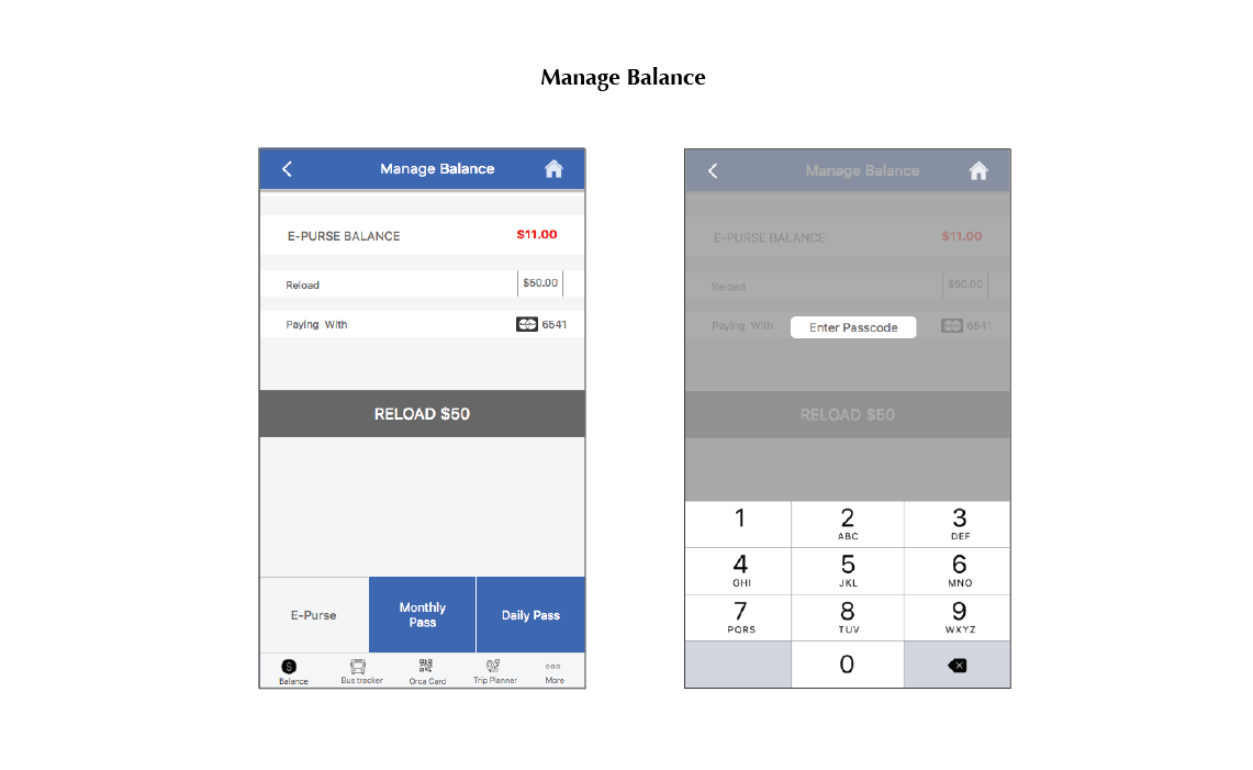
- Easily manage their accounts and add funds.
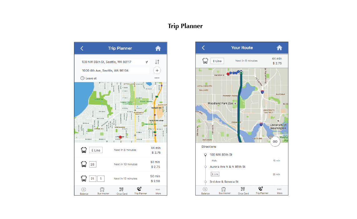
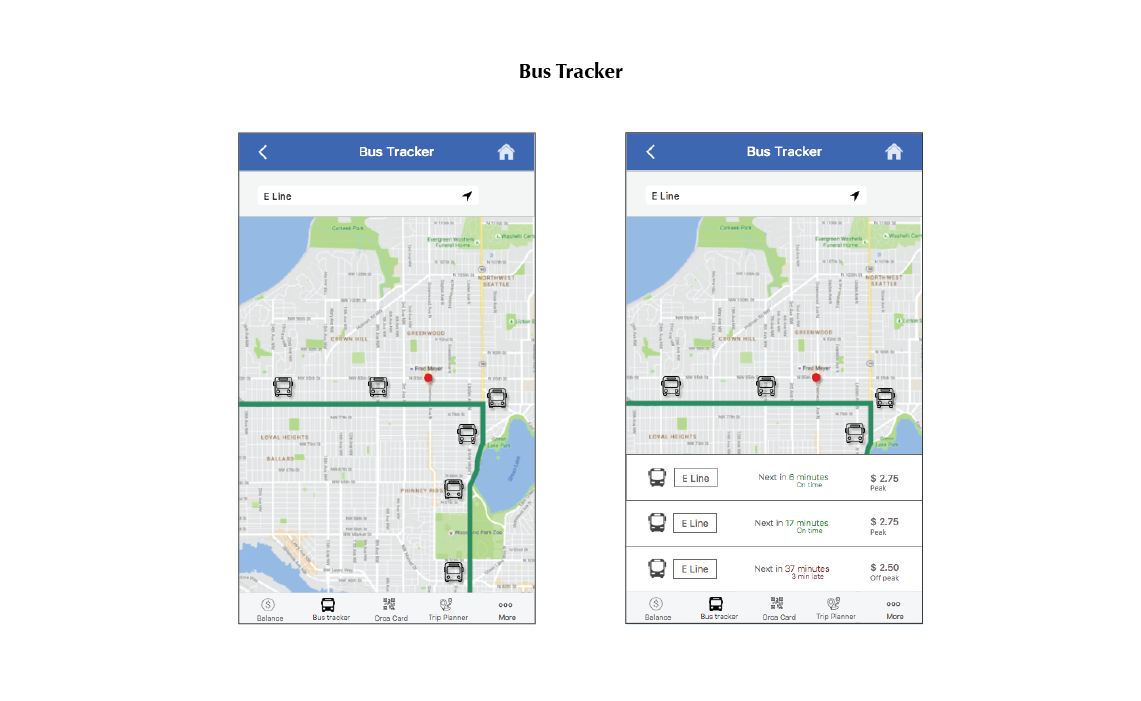
- Plan their trips better with accurate bus tracking feature and quick directions and routes.
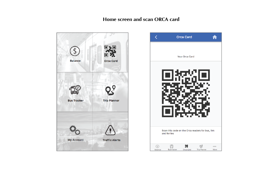
- Scan their phones as the ORCA card on the card reading machines.
My Role:
I collaborated with my team over User Research, Design flows and wireframes and Usability Testing. I was specifically responsible for:
- Studying the ORCA system and heuristic evaluation of their website.
- Persona development, User story and Customer Journey Map.
- Building the entire trip planning segment and home screen and their interactions in Axure.
Our Process
Research
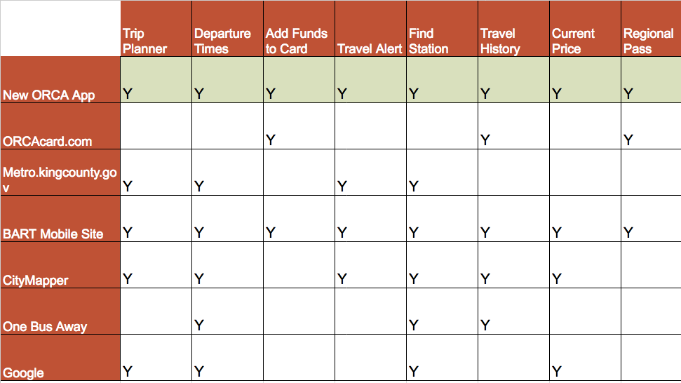
We started our research studying established smart card systems in other metropolitan cities and why they were successful. We compared ORCA with other competitors (apps or sites people use for their commute) to pinpoint what is working or missing in the current system. Our next and most important step was to understand commuters’ real needs and behavior when interacting with ORCA system.
We recruited participants through a screener and interviewed 14 individuals who frequently used ORCA Card for their commute. Our open eneded interview questions focussed on understanding
- Their painpoints and unmet needs in the commute.
- Aspects that work well and the ones that would improve their travel experience.
- Explore additional features that would make the new app invaluable in their commute.
Planning
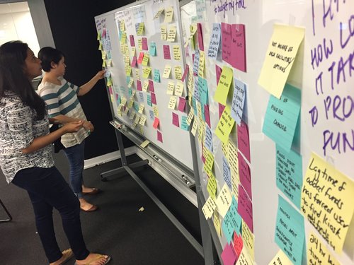
The affinity diagrams helped us organize the many facts and ideas collected during user-interviews into natural relationships for further analysis. It also proved to be a useful tool in testing our assumptions.
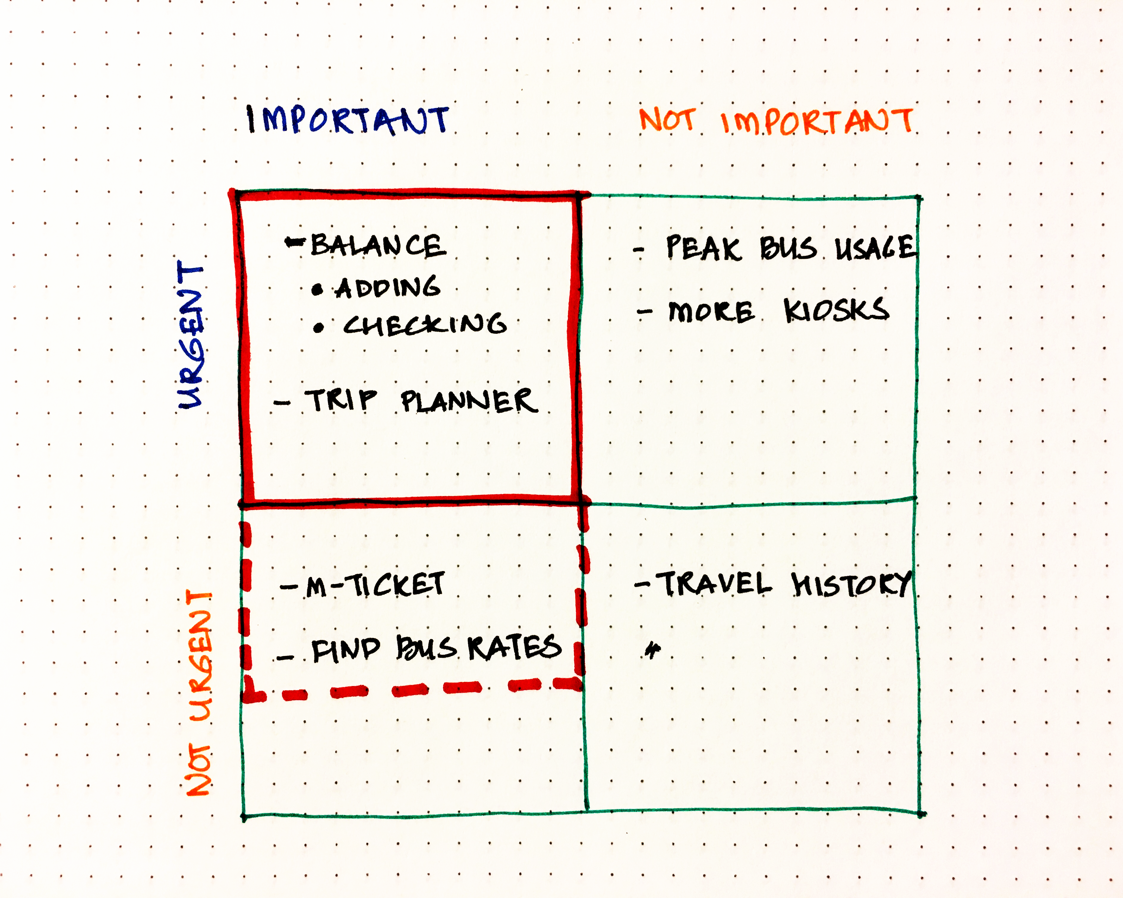
While we gathered many valuable insights through our affinity mapping, we decided to only develop the MVPs (minimum viable product) for this project due to the time constraint.
Minimum-Viable Product (MVP)
- Provide easy access to the account balance at all times and allow users to add funds with the new app.
- Help planning trips from start to end by tracking buses accurately and giving possible routes and directions
- Use phone as ORCA card with M-ticket technology.
Proto-Persona
I created a proto-persona based on our evaluated data to guide our design.

Customer Journey Map
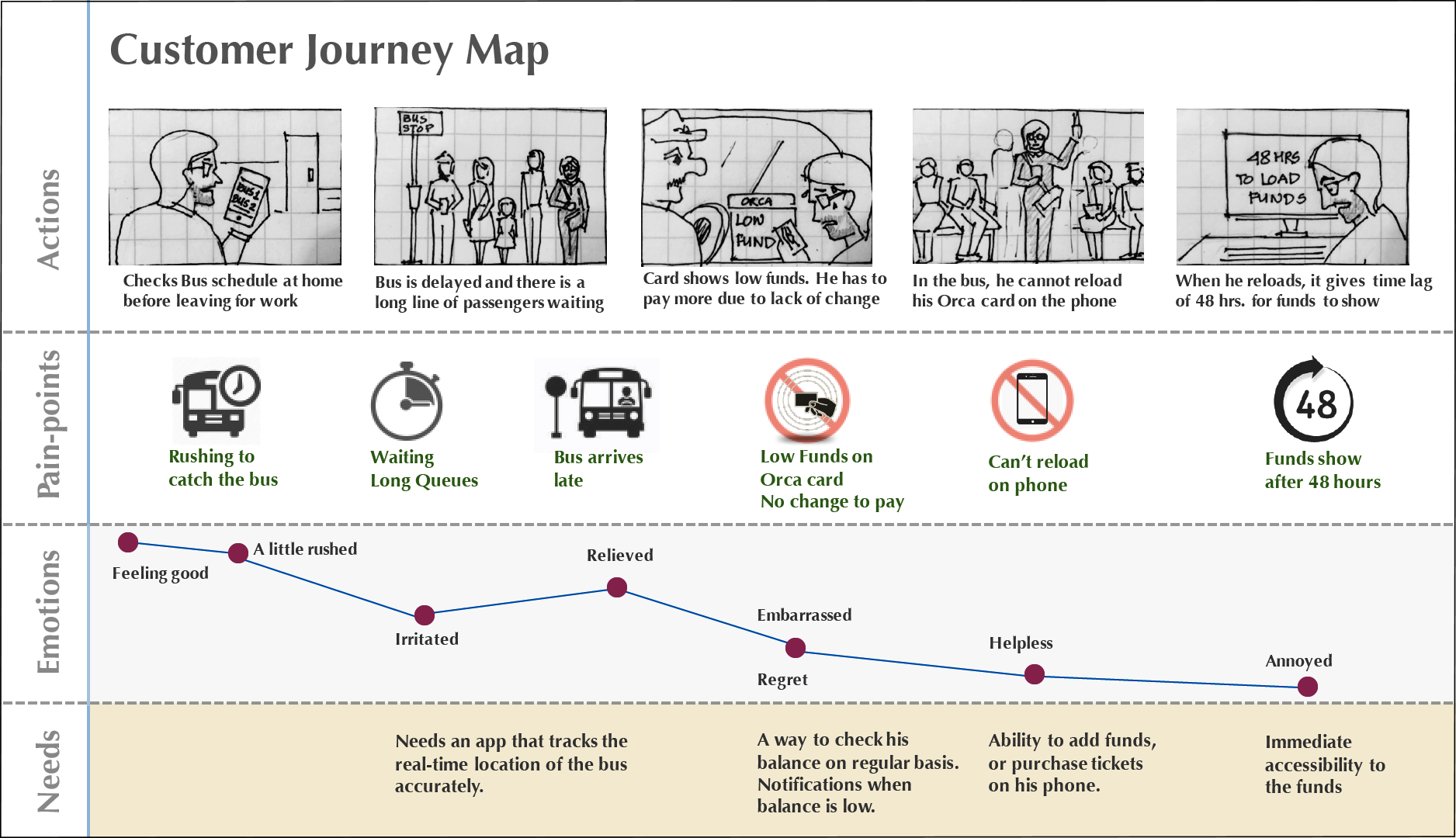
Using the persona, I developed a customer journey map that helped us find our persona’s pain-points during the commute and identify unmet needs and opportunities.
User-story
Harry is finishing his morning chores before leaving for work. He checks the bus schedule to leave accordingly. The bus arrival shows 10 minutes at his stop. He starts rushing things and when he gets to the bus stop, he sees a long line of people waiting for the bus. The bus is delayed again. When it finally arrives and Harry scans his ORCA card, it shows low funds. He has to start digging for change and ends up paying $10 for a single ride. He is also embarrassed to keep commuters waiting behind him. He is unable to load funds on his ORCA card in the bus and has to wait till he reaches work. When he finally reloads, it shows him a 48hr time lag before activation. Harry is so frustrated with the ORCA system.
Design
Design studio and sketches
We held a design studio in our team to communicate our ideas and build on them to generate better concepts and framework for wireframes. While we together devised each layout strategy on whiteboard, I sketched the layouts we finalized on paper. This worked as blueprints for developing screens in Axure and kept everyone on the same page.
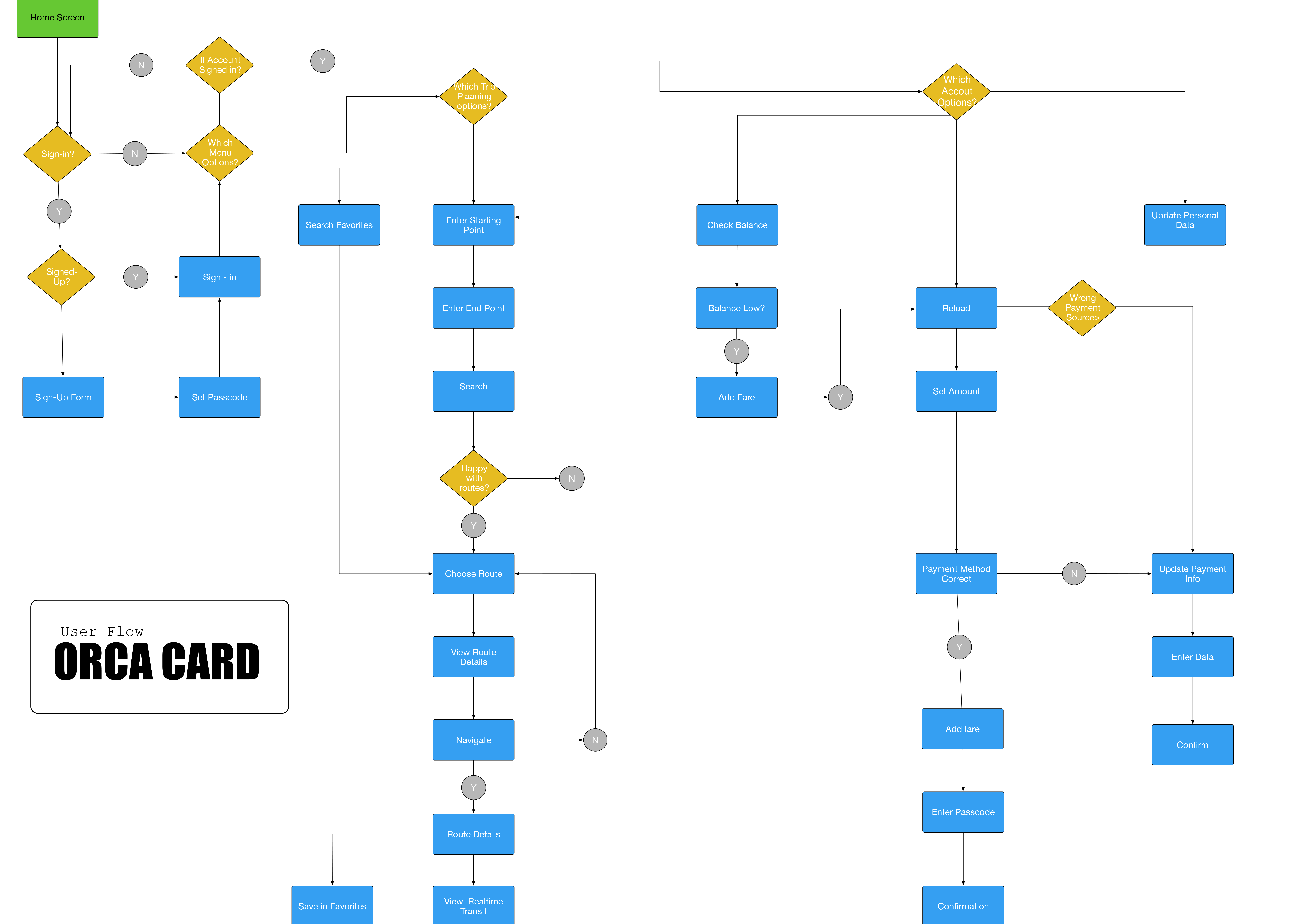
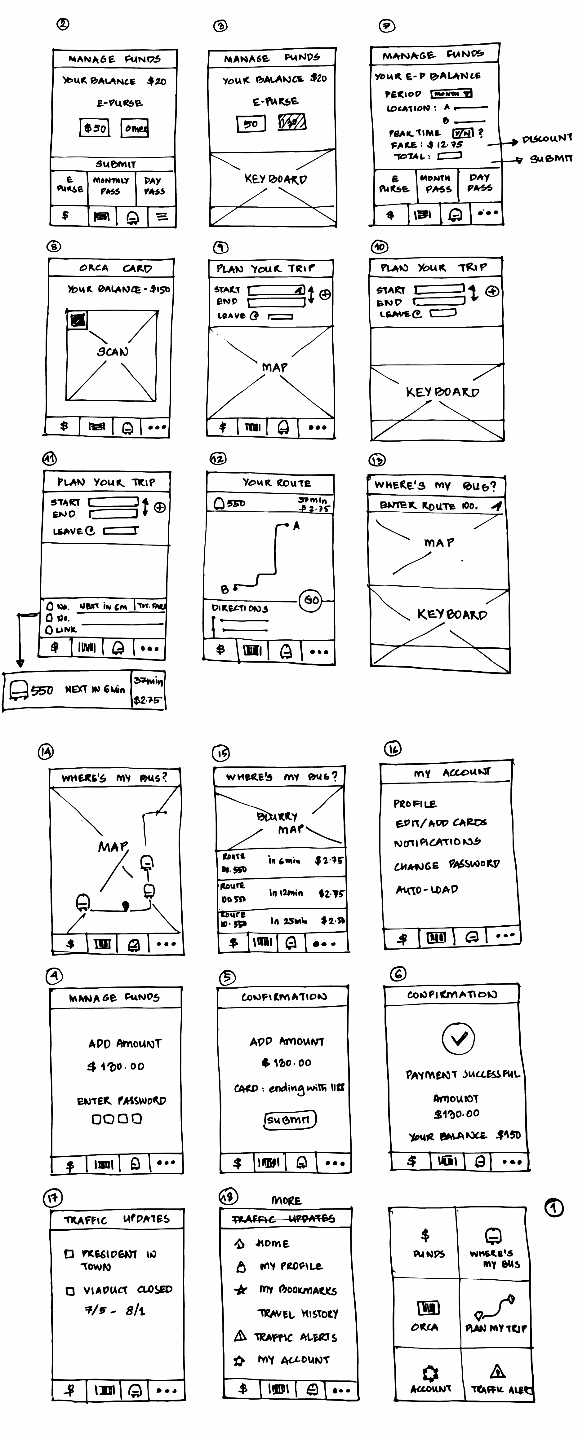
Prototyping and Testing
We built our prototype in Axure. I developed the trip planning interface while my other teammate, Rob worked on the adding funds screens. Our teammate Diana performed usability testing for the team and communicated her findings to us which helped us redesign certain features for better navigation.
Takeaways
Effective team collaboration:
At the start of the project, we built a functional plan which guided our communication throughout the project. We worked effectively as a team because we communicated our progress daily, supported new ideas and implemented each other's feedback to create stronger work.
Designing for MVP:
Project's scope can get large and out of hand very quickly. To account for changes in design due to usability testing or limitation of time on a project, it is important to first define and develop the fundamental design objectives based on data.
Design Studio:
Design studio is a highly interactive and effective method to build shared understanding of interface at the start of a design process. It helps team members reason their ideas with the team and give honest critique to strengthen design concepts.
